My personal interior style is continuously evolving, at times I find myself leaning towards bright splashes of colours, and then the minimalistic inside me quickly resurfaces.
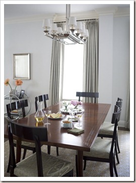
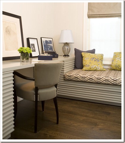
But ever since I stumbled upon Alexandra Angle’s website, all my whims and fancies have been well catered to. Today, I’m all about the less is more design philosophy like this classic Fifth Avenue home below.
What style of interiors are you currently smitten with?
{images via}
p.s. Sorry I’ve been MIA lately. Hopefully I shall be back in the blogosphere next week. xo.


I adore the look of dark wood paired with cream fabrics (à la the first photo)! It's clean and modern, but still warm.
ReplyDeleteLess is DEFINITELY more! :) Love the first pic.
ReplyDelete♡ from © tanvii.com
Loving these my friend. xoxoxo
ReplyDeleteamazing!! love all of them :)
ReplyDeletesydsense.blogspot.com
I have conflicting design styles too, one day I want all shabby chic and the next bright bold colors.
ReplyDeletethe kitchen has such a nice look to it =)
ReplyDelete-Bionica
lovely clean, tidy, & organized... can help create a serene environment
ReplyDeleteLove the classic look of this design. Very inspiring for my own home. It has that timeless look that is not dated.
ReplyDeleteCouldn't be in more agreement! Less is definitely more! I love simple arrangements that are easy to maintain!
ReplyDeletedon't we all continue to oscillate always:-)
ReplyDeletethese are definitely striking in their minimalistic deal:-)
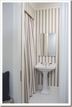
I love these photos. They are so French and feminine. The gray striped wallpaper is gorgeous in the loo - perfect for the typical teeny tiny ones for guests.
ReplyDeleteI added your button to my blog under 'blogging besties'. Thanks for the photo inspiration. I'm currently living in a dorm, but love daydreaming with your blog. Keep up with the great posts.
Michelle ;)
I am SMITTEN lately with pink. Less is more... but pops of hot pink have been making me SMILE!
ReplyDeleteGreat images!
Have a PRETTY day!
Kristin
Classic and sophisticated!!
ReplyDeletei always love pops of color, but done aesthetically!!....and less is more for me always....no cluttering of too many things!!
ReplyDeleteI totally agree in decorating that less is more...the stripe bathroom with the matching shower curtain is wonderful!!
ReplyDeleteI love this clean, sleek style! It is stunning!
ReplyDeletexo
Oh my design style preference is forever changing...
ReplyDeleteThat is one gorgeous home,
so orderly, serene, elegant.
Love the stripe bathroom ♥